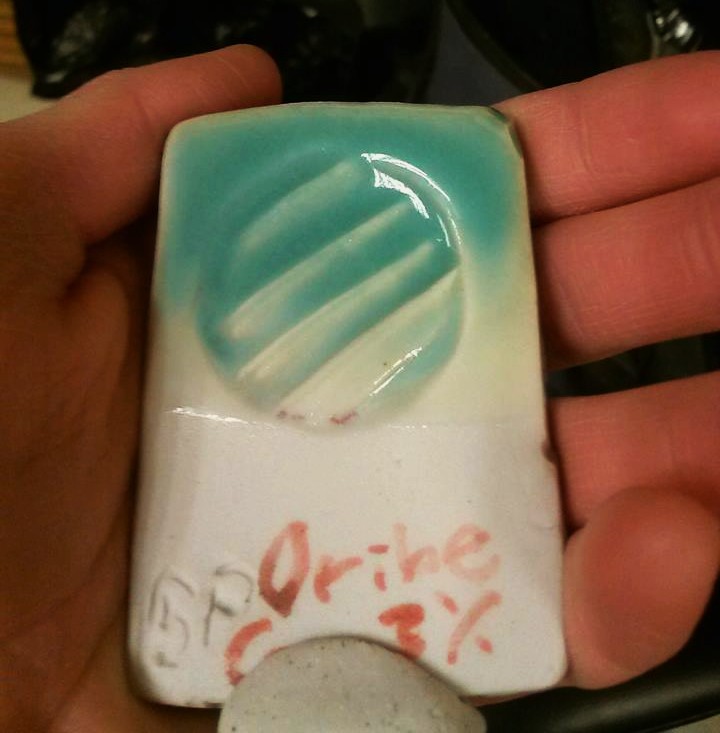
Alright, as promised– a photo of my glaze testing. Yeah, I have more tiles, but this is the one that I was most excited about. This was the result I was hoping for (or at least similar blue colors) with all but three of the 10+ test tiles in the kiln. I fired to a hot cone 10. This is the “Turquoise Oribe” glaze from the John Britt High Fire GLazes book with the copper reduced to 3% instead of 6.7, so it’s not nearly as saturated and won’t tend to go liver pink as easily. The problem with this beautiful glaze result is that I didn’t come up with the glaze myself. I did create a limestone glaze with the satiny surface that I’m more drawn to, and I tested varying amounts of copper and copper/tin blends in it, all of which turned light green. It makes an appealing green glaze, but I am trying to get blue. Guess I need to figure out how to diversify my fluxes and reduce the clay content a little bit… I see a quadraxial blend grid tile in my near future 😛 For now, I am very happy with this result and am doing a vinegar leach test, after which I will glaze a few pots with it if it doesn’t leach copper.
