Proteas in the Blaaaaaaauwwwww Kiln!

10153366_10203456661205358_1048432250_n


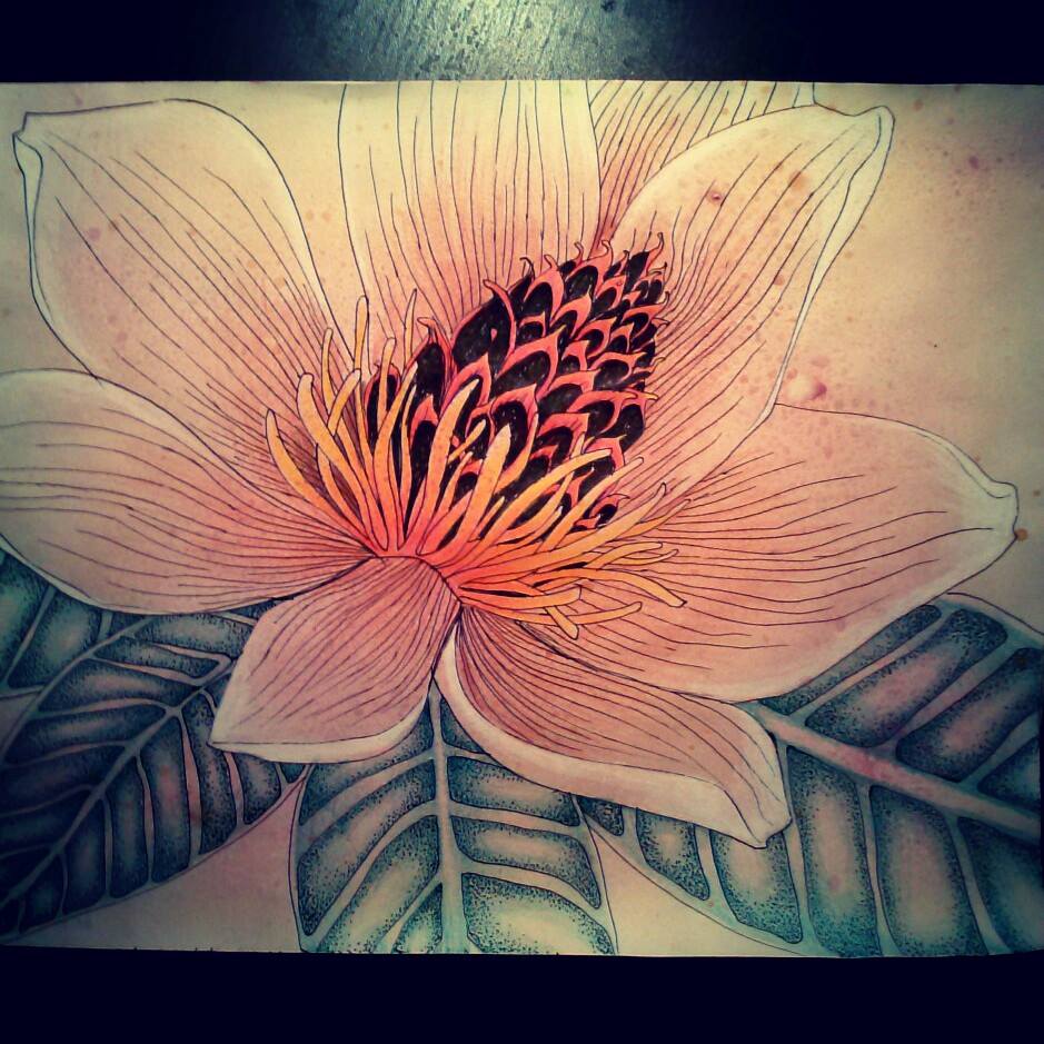
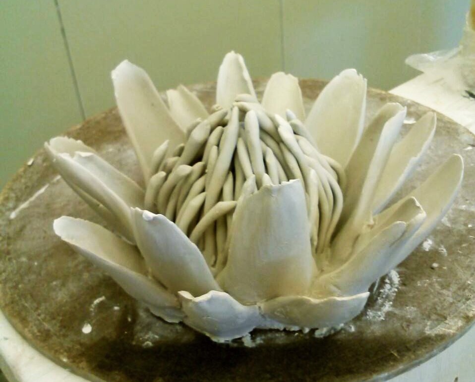
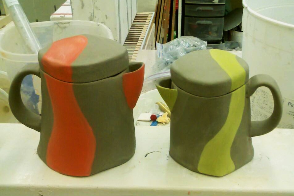
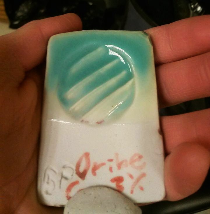
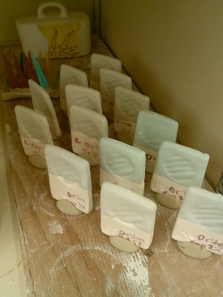
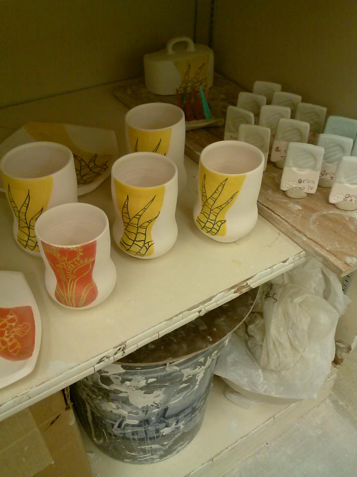
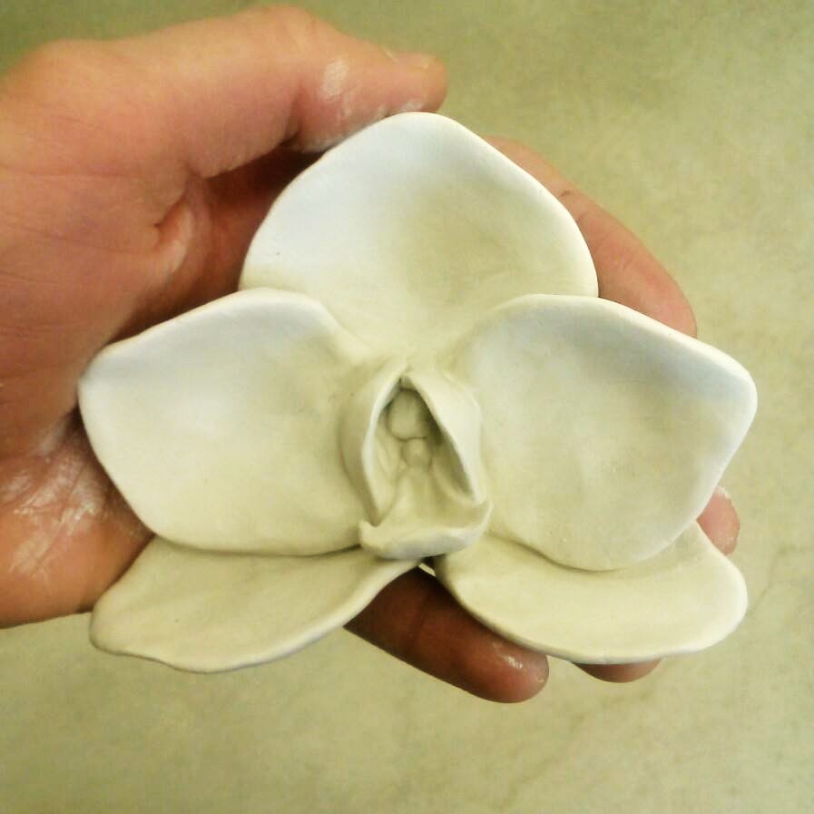
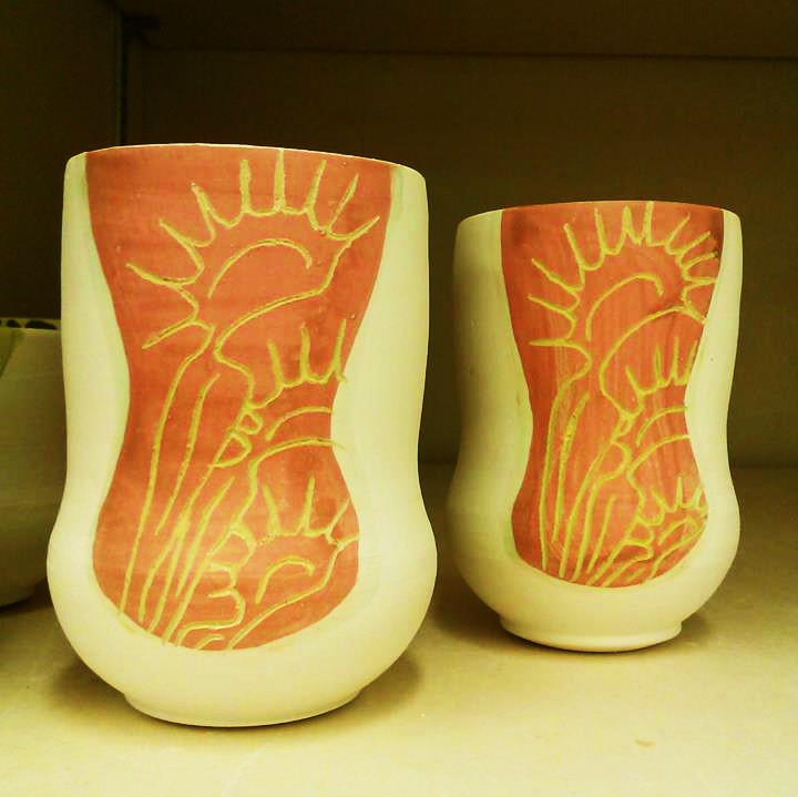
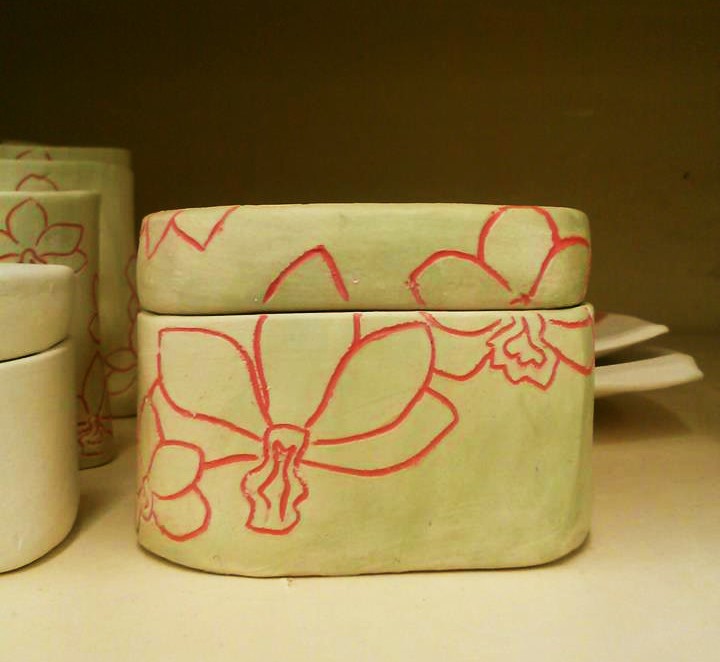
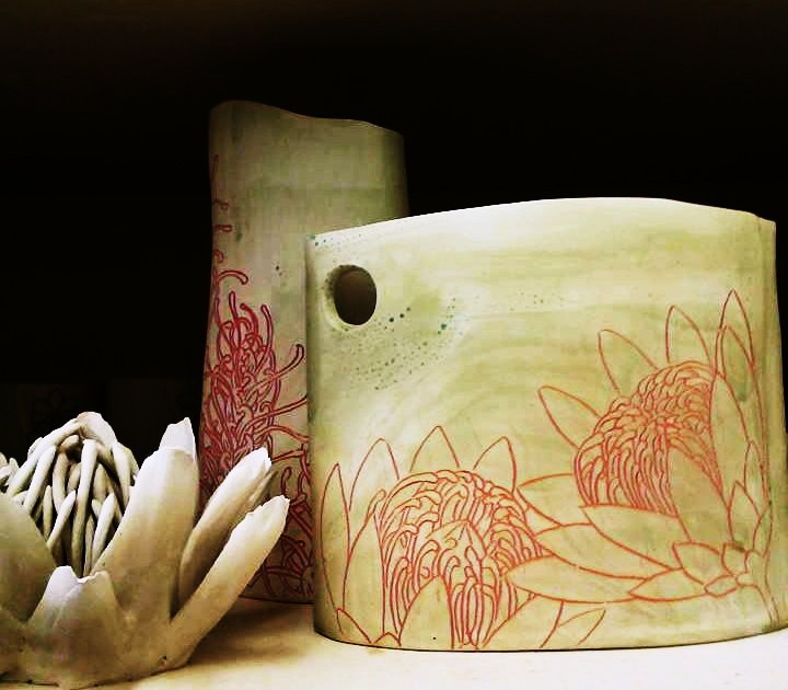
That was a snapshot of my studio shelf earlier this morning. Those pieces are all now in a bisque firing in our new Blaauw kiln. I have been working with a new flower theme lately– plants from the Proteaceae instead of orchids. I am in love with the detail and the visual texture of crowded intertwining lines. It’s incredibly tedious to draw these flowers, but the reward is great. I have been glazing work of this style with a transparent magnesium based glaze with almost no visible crazing. I hope they don’t crack in the kiln. These are also new forms for me. I have been doing more hand building that throwing lately, but I’m still not great at making strong smooth seams when I attach things.

I’m hoping to be able to load up a glaze firing in the Blaauw early next week, seeming as how I have an art show coming up, plus the sale, plus I need to just get new things fired already. It’s about time. I’m leery about firing to cone 10 in the Blaauw since last time it was programmed to fire in cone 10 reduction it actually went to cone 13 or 14 and it was a disaster for the grads who had to clean up the shelves from all of the pots that ended up glued to them by their own glaze. The glaze just ran off the pots. Some shelves were unsalvageable. I don’t want to be the next person to blame.

I will be the first one in the studio to give it a go for a cone 10 oxidation firing. I am sick and tired of trying to get oxidation in gas kiln #5. It gets so uneven every time that I feel the need to give it the slightest amount of reduction to even out, which turns into way more than I plan on. Last time almost everything went purple, except for the work on the very bottom shelves, which behaved and went blue. I’m hoping that the Blaauw will give me the evenness, temperature, and atmosphere that I want. I put so much time into my work that it would be a shame to see it all go purple/liver pink– again.

In other news, I am baking some lovely and super unhealthy blueberry muffins right now 🙂 I used a blueberry pound cake recipe and put it in muffin tins. I’m taking them to class this week 🙂

Posted in Art, Ceramics, Design, Drawing, Nature, Painting, Print Making, Science, Sculpture, Uncategorized | Tagged , , , , , , , | 1 Comment

Headachingly intricate flowers: my newest muse

10151643_10203425412944171_97508567_n

I started drawing this magnolia flower before my trip to Milwaukee for #NCECA2014 and didn’t finish it until last week. I left it home while I was away on the trip, and didn’t pick it up for a few days after I got back. I started stippling the leaves as a way to procrastinate the piles of homework I’ve been buried under. While I was in Milwaukee, I did take another sketchbook and I had some down time in the hotel room and during lectures where I decided to draw. On the plane ride back, I drew this angler/koi/cat fish with protea flowers from start to nearly finish (I added the stippling on the scales later):

10011350_10203370314966756_1974765118_n

And by the next day, my mind was already wrapping itself around the idea of drawing proteas on my pots. I’ve already been drawing heaps of grevillea flowers on my pots, so why not take the next step and draw other intricate flowers of the Proteaceae?

10152747_10203442582453398_1503492825_n

So after seeing how nice my grevillea cup turned out, I did the same red line drawn pattern to draw a protea on this plate (yes, that is a wasp hovering over the flower). I’ve been doing all of these drawings freehand, with occasional glimpses at instagram photos under #protea, #proteaceae, and #proteaflower. There are some beautiful photos of this lovely plant on there. Anyway, after drawing on this plate, I thought about my orchid sculptures and how they relate to my functional work– and decided to sculpt a protea flower in porcelain clay:

10149430_10203423856185253_924697156_n

I plan to paint it realistically after it’s bisque fired.

Now my decorating process takes longer than ever, but I am extremely satisfied with the results so far 🙂


Posted in Art, Ceramics, Design, Drawing, Nature, Painting, Print Making, Science, Sculpture, Uncategorized | Tagged , , , , , , , | 3 Comments

Glaze Testing: Copper Blue?

Sometimes, I get what I want from a glaze:

10153503_10203442616894259_1134815270_n

And sometimes I don’t.

10151065_10203442591093614_543893456_n

10169139_10203442592693654_1379658865_n

Yes, I know it is possible to obtain a beautiful blue glaze with additions of copper carbonate at cone 10 because I have two copper blue glaze recipes from the John Britt High Fire Glazes book that turn out awesome 75% of the time. They certainly never go apple green. The blue glaze in the top photo is the turquoise oribe recipe out of the book. I used to use it obsessively when I was salt firing in 2012, but abandoned the glaze after testing it in an indoor gas kiln (with 6.7% copper carb, the texture was rough and scabby). I recently decided to try testing it by taking out some of the copper. I did a line blend from 1-5% just to see if less copper saturation would make it more usable indoors. The results are awesome:

KC_15

This bottle has the turquoise oribe glaze applied and fired in oxidation at cone ten– with just 3% copper instead of nearly 7%. I will definitely keep using this glaze for a while, but I really want to come up with my own copper blue recipe. The second and third photo of tiles that turned green are my tests. The strontium addition of 15% made an attractive green glaze that I might be able to use, but it’s still not copper blue. I unloaded a test kiln just this morning with similar green results. Guess I’ll just have to keep testing. Wonder if I will get blue by the end of the semester…

Posted in Art, Ceramics, Design, Science, Uncategorized | Tagged , , , , , | Leave a comment

Project #JailhouseArtDemonstration: making new waves in the world of ceramic art!

10152770_10203382769558113_1096813889_n


This is my newest orchid sculpture- I painted it with my underglazes, mixing the colors like paint.

Mashima

So, above is a link to my decorating style (Mashima)– it’s a short video clip on Instagram. I’ve been trying to do more video recording of my making and decorating processes lately. 😉

1464781_10203327282330967_1615124750_n

I have some big news– just the other day, my boss came up to me and suggested an unlikely proposition. I thought it was a joke at first. She asked me if I would be interested in giving an educational lecture on ceramic art to inmates at a jail. I said that it sounded interesting, but I was unsure whether it was real or not. Come to find out, she talked to the educational director at the jail and they came up with the idea together. I had a 10:30 meeting to talk about it for real yesterday, and it has expanded into me giving my artist demonstration with my tools and clay for a full day, with 4 shift changes of inmates. I will be demonstrating and lecturing to 10 inmates at a time. The education director will be there with me, and she assured me that I will be safe. She said she feels pretty safe there with just 10 inmates at a time.

After asking me to give a demonstration at the jail, they also suggested that I give a full-on interactive workshop for the community. I still need to make the flyer and figure out the details… they haven’t gotten permission from the sheriff just yet, so who knows if it will actually happen, but it’s exciting none-the-less. I wonder if it has been done before– a visiting artist giving a demonstration for inmates at a jailhouse. This will definitely stand out on my resume and it will be a great story to tell if it happens 😉

The community workshop will be the scary part– I will be presenting/teaching 20-30 people, and there will be an entry fee (to cover the materials and my travel).

It will be my first ever demonstration/lecture, so I’m a bit nervous, but this sounds like a good way to jump into it. The best way to learn is to DO.

Posted in Art, Ceramics, Design, Drawing, Nature, Organizing, Painting, Science, Sculpture, Uncategorized | Tagged , , , , , , , | Leave a comment

Kissing Coffee Pots, and other “silly things” :)

10002782_10203304953332756_1947611199_n


Alright, yes. “Kissing Coffee Pots”. I might even put them together at an exhibition and call them that, just for fun. I am decorating the red-striped one with Grevillea flowers, and the green striped one with red lilies. I might apply the same blue glaze to both pieces to unite them. I do have the Botanical Art at the Herbarium exhibition show that I could put them in if they are finished by then. Truthfully, they are clay tests, and new form tests at the same time. If they don’t turn out worthy for sale, oh well. I will enjoy using them. I am hoping that this new gray clay recipe fires relatively white, as it is supposed to. It is slightly more workable than my Grolleg porcelain, and much more affordable. It’s 18% cheaper, and the example I saw fired to cone 10 was fairly white. I need to make more plates, which take more clay. I have made plates with my Grolleg porcelain, but they were almost too dense, and the Grolleg porcelain was temperamental to trim. I don’t think this clay is quite as dense, and since it is inexpensive it will make the perfect practice medium for plates that I can still decorate with bright colors and transparent glazes.


10009583_10203305332102225_1584500021_n


I finished decorating one of the coffee pots with the red lily design. I want to apply a light aqua blue glaze (3% copper) to the surface of this coffee pot. I am so excited to be able to test out these new hand built coffee pots. Now I’ve got three of them made 🙂 They have sieves built in to the walls. I am hoping it will be a functional way to go, but I have thought about making coffee pots with wire mesh added after firing, or making a separate chamber that allows a coffee filter to be placed in the pot and the filtered coffee to go through the spout whose directory starts at the bottom of the coffee pot, like a cream separator. Who knows. I am always debating what is most functional. These might just end up as nice hand built tea pots until I figure it out.

1579776_10203307264710539_1858821438_n


This little guy is a cream/gravy pitcher. If it doesn’t sell, I might end up adopting it as my egg-poaching pitcher. I know “egg-poaching-pitchers” probably aren’t in high demand, but I always find myself in need of a good one-egg pitcher for ‘pouring’ eggs into the poaching pan one at a time. I have a Kait Arndt espresso mug that serves the purpose beautifully, but unfortunately it is hundreds of miles away right now 😦

Posted in Art, Ceramics, Design, Drawing, Nature, Science, Sculpture, Uncategorized | Tagged , , , , , , | Leave a comment

I’ve got BLUE!

1927145_10203272793808788_542659005_n


Alright, as promised– a photo of my glaze testing. Yeah, I have more tiles, but this is the one that I was most excited about. This was the result I was hoping for (or at least similar blue colors) with all but three of the 10+ test tiles in the kiln. I fired to a hot cone 10. This is the “Turquoise Oribe” glaze from the John Britt  High Fire GLazes book with the copper reduced to 3% instead of 6.7, so it’s not nearly as saturated and won’t tend to go liver pink as easily. The problem with this beautiful glaze result is that I didn’t come up with the glaze myself. I did create a limestone glaze with the satiny surface that I’m more drawn to, and I tested varying amounts of copper and copper/tin blends in it, all of which turned light green. It makes an appealing green glaze, but I am trying to get blue. Guess I need to figure out how to diversify my fluxes and reduce the clay content a little bit… I see a quadraxial blend grid tile in my near future 😛  For now, I am very happy with this result and am doing a vinegar leach test, after which I will glaze a few pots with it if it doesn’t leach copper.

Posted in Art, Ceramics, Design, Science, Uncategorized | Tagged , , , | Leave a comment

New designs! Lilies and Equisetum

10003321_10203269099436431_931743103_n


Alright, I’m taking my botanical illustration to a new level on my newest pots. I like to deviate from my main style every now and then. I came up with the red line drawing idea while I was in Australia last year, and I like it enough to keep using it. Today it dawned on me that I’ve only been drawing orchids and Grevillea flowers with the red lines, so I decided to pull my lily design and use it in the same way. After decorating the lily bottle, I had the wonderful idea of drawing Equisetum on the other bottle. Equisetum is a common native fern found in relatively dry areas of the intermountain west. I’m not sure how far it can be found east or abroad, but I’ve grown up familiar with the funny “joint grass” that pulls apart in sections. There are 3 species that I know of here, E. hyemale, E. arvense, and E. scirpoides (not entirely sure on the last one, but that looked the closest to what I saw in Wyoming on roadsides growing up). I wanted to illustrate something unique but also something I’ve been familiar with for a long time that is common but often overlooked. Equisetum is a beautiful plant, well-deserving of illustration on my pots. I am unloading a kiln tomorrow with the aforementioned glaze tests in it– I fired it off today.

Posted in Art, Ceramics, Design, Drawing, Nature, Painting, Science, Uncategorized | Tagged , , , | Leave a comment

Filling my life with bright happy colors! Some new photos from the studio

room photoshoot pots 022


Alright, here’s a challenge: try to guess where the photo of this teapot was taken… 3… 2… 1… nope. Not at the studio with the big pain in the ass setup. I took this photo in my bedroom, on the floor with a piece of cardboard resting against the wall, and a clippy light on a stick held in place by setting a box on top of it on my bed. Yeah, it sounds crazy, but it’s nice to be able to do laundry, make dinner, and wear my pajamas while imaging my work. Wouldn’t you agree? I thought the results weren’t too shabby. It’s about time for a new camera battery though, if I can find one. Maybe I should just invest in a new camera– it has been over 4 years now. Anyway, you should have seen how many projects I had going on at once half an hour ago.


10002900_10203248587283640_1050831001_n


I’m hopeful about these glaze tests. I read up some more about copper blue/turquoise, and decided to test something I read. I picked one of my newly developed glazes that I targeted off of a grid tile (based on Ian Currie’s 0.7  limestone set corner glazes), then mixed tin and copper in varying amounts in that glaze to create 8 different combinations. I also decided to see what difference lowering the copper content in an oribe base would do (the oribe is the salt and soda “Turquoise Oribe” glaze from the John Britt book). I’m curious to see if it needs help fluxing out when fired in an indoor gas kiln without salt.


1481962_10203248591003733_1931804665_n

I’m getting ready for my upcoming show, so my space is a little crowded. I’ve been trying to reorganize but things just keep building up. I had to set my bisque ware down where I usually just keep wet green ware. More photos of that stuff later. I made an orchid about a month ago, bisque fired it, and let it sit until my professor suggested buying a live orchid plant to bring in to the studio as a reference for painting.

1779394_10203038362228145_1607453648_n


I had a lot of fun with it. I took my time and painted with as much detail as my brush and eyes would let me. I used amaco velvet underglazes modified with gerstly borate, watered down a lot. I didn’t apply any glaze over it, but was pleasantly surprised after I glaze fired it to see that it was satiny and just very slightly glossy on the surface. The idea behind trying to sculpt and paint orchids realistically is something I want to pair alongside my functional work somehow.


1974451_10203249187858654_5608882_n


Posted in Art, Ceramics, Daydreaming, Design, Drawing, Nature, Painting, Science, Sculpture, Uncategorized | Tagged , , , , , , , | Leave a comment

Ideas New and Old

1957362_10203148413859367_1815000157_n


Studio update: the photo above is of one of my newest decoration ideas. I wanted to draw venus flytraps on some whiskey cups just for fun 🙂 I will decide if I like one way of drawing them over another in the long run. I plan to put a copper green glaze on them that will give a vignette effect by fuming around the edges of the underglaze. It should spice them up 😉


1961448_10203168720367017_1803739346_n


I’ve started making soft slab lidded boxes lately. I made one last semester and decided that I really like how it turned out, so I added it to my proposal plan. I finished making this box (above) today. I decided to resurrect a decoration idea that I used in the studio while I was in Australia. It turned out successful on my figure sake cups that I made while I was there, so I want to try it here– but I plan on using my new clear glaze that I recently formulated in glaze calculation class. I picked to study barium set glazes this semester because I am interested in a glaze that will give me bright colors. What I found is that barium, like magnesium carbonate, creates a nice satiny glazed surface. It reacts differently with added colorants than magnesium does, though. I do have a few test tiles of my barium glaze with additions of copper carbonate, but they weren’t fired in the right atmosphere for them to turn blue. When I added 3% copper carb to my magnesium satin matte that I formulated two years ago, it turned olive green. It still makes an attractive glaze, but at the time I was hoping for a nice blue color. Barium is more likely to promote bright colors than magnesium, or so I’ve read 😉

What got me thinking about the red orchids design again is that I’ve been talking to a new friend from New Jersey. He’s a tattoo artist and got me thinking about an idea I had a couple of years ago– I did once consider getting a tattoo, but decided against it because the imagery didn’t mean enough to me personally. Talking about it made me realize that I do value something enough that I would consider having a tattoo of it, something I draw almost every day, something beautiful that carries meaning in my personal life. Orchids. I am now considering the idea of getting a small and simple orchid tattoo on my upper back near my neckline. Of course, I will still think about it for at least a couple of months before taking the idea seriously. I would need to decide on what genus/species of orchid I would want, and whether I want full color or just a red line drawing because it’s simply elegant. Anyway, I drew 3 different ideas in one, just to test it out 🙂

1903145_10203152185673660_951220208_n


Posted in Art, Ceramics, Deep Thought, Design, Drawing, Nature, Science, Uncategorized | Tagged , , , , , | Leave a comment

Virtual Orchid Tour– see how I get inspired

I’ve been doing some brain storming regarding my surface decoration. Tonight, I decided to go on a random meander online just typing in simple keywords, starting with “orchid”.

Pink_fingers


The search came up with about 6 sub-categories. I clicked on “types of orchids”, which was first organized by color. One of those sub categories was “spider orchids”, so I clicked to view all images.

5131289620_c444afae69_o


It gave me some good results, but most of the orchids were ones I was already familiar with, or not drawn to. I typed in “red spider orchid” to narrow it down more. It was only tonight that I realized that people commonly call Oncidium and Miltonia “spider orchids”. It reminds me of when I started working at the herbarium and only really knew common names, but the professor supervising there was only familiar with scientific (Latin) names.

Typing in red spider orchid didn’t help much, as it was mostly big flower arrangements and I am looking for detail photos, so I typed “orange” in the place of red.

Western-Australia-Spider-Orchid


I found this nice close up of an Australian orchid, but then started thinking about local orchids, like Habenaria and Platanthera, which made me decide to type in “orchids of Wyoming”. Photos of the calypso orchid sprinkled the results throughout. I like the calypso orchid, and I have stumbled upon it in the hills of Wyoming one very wet June, but I was more interested in the fragrant tiny green orchids.

habenaria_repens_robust_spike_over_black


I have found these beautiful orchids growing next to my favorite bridge in the park near where I grew up. Its smell is overpoweringly sweet in the most pleasant way, and the flowers are so discrete that it leaves you discouraged as to where the beautiful smell is coming from. When I went looking for the orchids in the same spot last summer, they weren’t there. It may have been too early for them to be visible in the dense patch of Equisetum it grows in.

I am trying to decide how to illustrate the more complex plants I love on my pots, and I would really like to start showcasing unique, rare, and sneaky local plants, such as tiny orchids and lilies. I illustrated some cups with venus flytraps yesterday. I will post photos of work soon.

Oh, and I did my homework that my professor suggested– I bought an orchid to look at for direct observation for the coloration on a tiny orchid sculpture that I’m working on 🙂

Posted in Art, Creative Writing, Design, Nature, Science, Uncategorized | Tagged , , , | Leave a comment